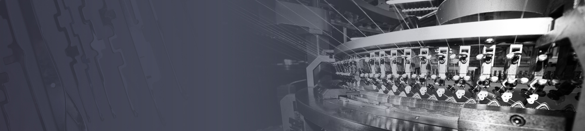
For the best of global knitting industry
-
텍스트

-
텍스트

-
텍스트

-
텍스트

-
텍스트

텍스트
텍스트
텍스트
텍스트
텍스트
For the best of global knitting industry
Samsung CU's new CI has inherited the history and tradition of the company,
We have revitalized our brand to revitalize the brand and make it a universal standard for the global knitting industry.
Since 1995, we have renewed the corporate logo with a new transformation, revitalizing the aging corporate image, and renewing aspects that inherit the existing history and reliability. We keep the symbol shape and color which symbolize Samsung Schnapps Co., Ltd., which has been walking for a long time with the faithfulness and enthusiasm for making knitting needles, and set the usage rules so that customers can show unified images.
Symbol Mark Visual image
The Symbol Mark is a visual representation of the image that Samsung Scratch Co., Ltd. intends to express. We strive to maintain image consistency with the most visible visual communication tools.
![]()
Logo Type communication
The logo type is a design element developed to be harmonized with the symbol mark as a basic element which is the core element of C.I communication of SAMSUNG SOPHEE together with the symbol mark.
![]()
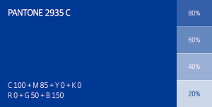
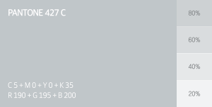
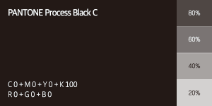
Color System brand identity
Dedicated color is an important design element expressing the identity of Samsung Copper Co., Ltd.
Blue is reminiscent of trust and expresses brand identity that is active both inside and outside of the world based on sophisticated gray which means unchanging technology and quality over time.
Brochure Downloads
Contact Us

Samsung Knitting Needle
Global Marketing Team
